Why Most Photo Galleries Force You to Choose
Most photo galleries force a choice: crop everything to one aspect ratio for visual consistency, or preserve full images and accept that some orientations will dominate the page. Instagram’s square grid favors neither landscape nor portrait. Masonry columns let tall photos overshadow wide ones. Justified rows do the opposite.
This post documents a different approach: a cell-based grid layout that gives landscape and portrait photos equal visual weight without cropping. The core trade-off is explicit: sacrifice some space efficiency for equal presentation — some grid cells remain unused, but portraits and landscapes occupy comparable visual area. The result feels more like photographs pinned to a wall than tiles arranged by an algorithm. You can see this approach in action at kadykov.com/photos.
I’ll walk through common gallery layouts — square grids that demand cropping, masonry columns that favor portraits, flexbox and justified rows that privilege landscapes — and show you the specific trade-offs each makes. Then I’ll explain the cell-span strategy: a CSS Grid approach that gives equal visual weight to all orientations while accepting lower space efficiency as the cost. All layout examples are available as interactive demos in the accompanying CodePen collection.
The Problem: Photos Don’t Fit Neatly
Photos arrive in every imaginable shape: a 3:2 landscape from a camera, a square crop, a vertical phone shot, a panorama. They all compete for space on the same page, and the page itself varies — a phone in portrait, a tablet, a wide desktop.
Every layout is a compromise among three key characteristics:
- Equality of presentation — give photos with all aspect ratios fair visual weight. Portraits are as important as landscapes.
- Space efficiency — show more photos as large as possible without wasted space.
- Visual rhythm — the pattern formed by gaps and alignments.
These goals interact and often conflict. Equality and space efficiency pull in opposite directions: making every photo equally prominent usually wastes space, while squeezing for maximum density tends to favor the most common shapes. Visual rhythm is related but different — it’s an aesthetic choice about how orderly or organic the page should feel.
In practice you must choose which compromise to live with: preserve full images and accept varying empty space; crop for perfect rhythm and commit to an aspect ratio; or try hybrid approaches that trade some efficiency for more equal visual weight. The rest of this post explores those trade-offs and the layout I arrived at.
The Usual Suspects: Common Approaches
The Square Grid Compromise: Crop Everything or Accept Chaos
Cell-centered grids
Start simply: put each photo with its geometric center in the middle of a uniform cell. This is the most straightforward grid layout — the photo’s center is aligned inside the cell.

A common baseline is object-fit: contain. It shows the full image inside the cell, by fitting the entire photo within the cell boundaries without cropping. Here’s how you might implement this (interactive demo):
/* Baseline — no cropping: full image fits inside the cell */
.gallery {
  display: grid;
  grid-template-columns: repeat(auto-fill, minmax(200px, 1fr));
  gap: 1rem;
}

.gallery img {
  width: 100%;
  height: 100%;
  object-fit: contain; /* show the full photo, with letterboxing */
}
However, this straightforward implementation comes with drawbacks: photos come in many shapes and proportions, so placing every photo centered in identical cells results in inconsistent empty space — portraits leave bars on the sides, landscapes on the top and bottom. This wasted space doesn’t align across the grid, breaking the rhythm and undermining visual coherence.
That inconsistent empty space is a common reason why many designers and sites choose to crop previews: adopting a fixed target ratio (square, 4/5, etc.) keeps cell dimensions uniform and the page visually consistent.
Here’s what that looks like (cropped previews):

The CSS change is small: keep the same grid declaration, but switch image sizing to a fixed aspect ratio and object-fit: cover (interactive demo):
/* Keep the same grid (see above) — only change the image rule */
.gallery img {
  /* ensure previews match the target aspect ratio */
  aspect-ratio: 1 / 1; /* or 4/5, 3/2, etc. */
  object-fit: cover;   /* fills the cell, cropping overflow */
}
This approach gives you maximum space efficiency and a strong visual rhythm. Because every cell shares the same dimensions, gaps align into continuous leading lines: vertical edges form guides across rows, and horizontal edges form guides across columns. That repeated pattern is what we mean by rhythm — consistent spacing and aligned edges that guide the eye.

But what exactly do we mean by visual rhythm? Visual rhythm arises from repeated, predictable structure: when elements and gaps align across the layout, the eye perceives a pattern. In gallery design, that pattern is created by the aligned edges of photos and the spaces between them. When gaps line up, they form continuous leading lines that guide the viewer’s eye; when they don’t, the composition reads as looser and more spontaneous.
Leading lines are simply the aligned edges and consistent gaps that the grid produces. Strong, repeated leading lines create a mechanical rhythm — excellent for tidy, navigational grids — while breaking those lines yields a more organic, "pinned-on-a-board" feel. Increasing gap size makes these lines more visible, but it also reduces space efficiency and draws attention to the layout itself rather than the images.
With this understanding of visual rhythm and leading lines, we can now see why the contain baseline feels less coherent: letterboxing bends those lines by asymmetrically enlarging the gaps, and the grid feels inconsistent. The straight and periodic leading lines of the fixed-aspect grid can produce a strong sense of order; that order can feel mechanical rather than organic. In some configurations with thick and high-contrast gaps, when multiple rows and columns are visible from specific viewing distances — the regular grid pattern can trigger the Hermann grid illusion, where phantom dark spots appear at gap intersections. In practice, this effect is rather rare, as most gallery designs don’t meet these conditions.

By contrast, the contain baseline feels less coherent: letterboxing bends the leading lines by asymmetrically enlarging gaps, making the grid feel inconsistent.
If you choose cover cropping, you must then choose a cropping strategy. The simplest is center crop, the naïve default that can be implemented with pure CSS — but it often clips subjects placed off-center, as the center isn’t always the most important part of the image.
To improve on this, you can preprocess photos with smart crop techniques. For example, smartcrop.js uses heuristics like faces, edges, and visual weight to select safer crops without any AI involvement. If you’re willing to go further, AI-assisted cropping can detect subjects more accurately and recommend crops, though this adds processing overhead.
For the most creative approach, opt for editorial tight crop — manually crafting dramatic, teaser-like crops that prioritize visual impact over preserving the full image. This requires the most human judgment and effort, turning cropping into an art form in itself. Note that this method is better suited to editorial galleries, where curated emphasis guides the narrative, rather than navigational galleries that prioritize equal presentation.
When Changing Your Mind Breaks Everything
Whichever cropping strategy you choose, there’s a deeper problem: using fixed aspect ratios with cover cropping works well — until you decide to change the ratio. Once you pick a target aspect ratio and users compose content for it, changing that ratio later becomes destructive.
Instagram demonstrates this risk. They originally enforced square previews — a neutral choice that worked on both mobile and desktop. In early 2025, they announced a shift to portrait-oriented rectangles, which makes sense for a mobile-first platform.
The change broke existing content. Photos that were composed for square display suddenly got cropped differently. Subjects intentionally placed at edges — perfectly visible in the old square previews — were now cut off.
The lesson: fixed aspect ratios require commitment. Changing them later harms content that was composed for the original ratio.
Ultimately, the choice boils down to preserving full images with inconsistent spacing and broken rhythm, or cropping for a tidy, rhythmic grid — but at the cost of committing to a fixed aspect ratio that can be painful to change later. If you want equal visual weight between orientations without cropping, the next section describes an alternative approach.
Vertical Flow: The Column Layout’s Portrait Bias
If you want to preserve every photo’s full composition without cropping and use the space efficiently, the CSS columns layout is one of the options. It uses fixed column widths so images keep their intrinsic aspect ratios while the columns create vertical stacks.

Here’s a minimal implementation (interactive demo):
/* Baseline: CSS multi-column layout */
.gallery {
  column-width: 250px;
  column-gap: 1rem;
}

.gallery img {
  width: 100%;
  margin-bottom: 1rem;
}
Columns layout is attractive because it preserves composition, has minimal wasted space, and feels less rigid than strict cells. However, it comes with characteristic behaviors worth understanding.
The most visible characteristic is that taller images occupy more vertical space than wide ones, so a single portrait can outweigh two landscapes beside it. This portrait dominance is reinforced by the layout’s directional rhythm: consistent column widths produce strong vertical leading lines repeated horizontally, creating a unidirectional flow. This isn’t a flaw — for portrait-focused collections, this visual prominence can be a feature rather than a bug, naturally emphasizing the work’s primary orientation and guiding the eye down columns. You can tune this effect by adjusting gap size — wider gaps make the vertical lines more pronounced, while narrower gaps soften the directional emphasis.

The Fill Order Problem
Beyond these visual characteristics, the column layout has one practical quirk that often requires attention: by default, multi-column layout fills top-to-bottom, then left-to-right (like text). For long galleries this can hide recently added photos below the fold — viewers often expect the newest items to appear first across the top row, not stacked down the first column. This also affects keyboard and screen-reader navigation: users traversing the DOM encounter photos in column order, not the visual left-to-right sequence.

Fixing this requires JavaScript: you need to reorder or position items so the layout fills left-to-right row by row instead of the browser’s default text-like flow.

CSS Grid’s experimental masonry feature could address this fill order issue with a CSS-only implementation — it supports both vertical tracks (column-like with natural fill order) and horizontal tracks (row-like), with the ability to vary track sizes and span elements across adjacent tracks. However, browser support remains very limited as of late 2025, making it impractical for production use.
So in summary: the columns layout preserves full images and feels organic. Portrait dominance and a pronounced directional rhythm are natural outcomes — not defects — and can be used deliberately or tuned via gap size and composition choices. The fill-order quirk is the main practical downside to address if you want a traditional left-to-right browsing sequence.
Horizontal Stretch: Justified Rows and the Landscape Advantage
The column layout sets equal widths and lets portraits dominate vertically. What if we want landscape photos to take precedence instead? The answer is to flip the constraint: set equal heights and align images into rows. Flexbox wrap offers a CSS-only starting point for this approach.

Because width maps directly to area when heights are fixed, wide images naturally dominate. A single landscape or panorama can occupy as much visual weight as several portraits combined — the same effect that made portraits stand out in the column layout now applies to landscapes here.
That landscape dominance is reinforced by the layout’s rhythm. Rows with aligned gaps create strong horizontal leading lines, producing a unidirectional flow that emphasizes horizontal movement across the page.

However, there’s a fundamental constraint. Columns can grow infinitely tall — the page simply scrolls. Rows cannot grow infinitely wide — the container has a fixed width. When images share a fixed height but vary in aspect ratio, each row ends up with a different total width. Some rows fall short of the container edge; others might overflow.
This imperfect alignment weakens the horizontal leading lines. While gaps between rows remain consistent, irregular edge margins break the visual rhythm.
You have two main options to address this: distribute the extra space among images, or crop images to fill the row exactly.
Flexbox with Variable Spacing
The less destructive approach preserves original compositions by distributing leftover space rather than cropping. Flexbox offers several strategies, each making different trade-offs:
.gallery {
  display: flex;
  flex-wrap: wrap;
  justify-content: center;  /* or space-between, space-evenly */
  gap: 1rem;
}

.gallery img {
  height: 150px;  /* fixed height for all images */
  width: auto;    /* width determined by aspect ratio */
}
With justify-content: center, images group together with consistent gaps, while edge margins vary (interactive demo). With space-between, the first and last images pin to container edges, while gaps between images vary (interactive demo):
With space-evenly, both edges and gaps vary, balancing the compromise:
Regardless of which you choose, the horizontal leading lines are weakened by inconsistent edge margins or gaps, and the rhythm feels less pronounced than in strict column layouts.
Growing to Fit: The Cropping Trade-off
If you want rows to fill the container exactly, you can use object-fit: cover with flex: auto to make flex items grow and fill the available space (interactive demo):
.gallery {
  display: flex;
  flex-wrap: wrap;
  gap: 1rem;
}

.gallery img {
  height: 150px;
  flex: auto;        /* grow to fill row */
  object-fit: cover; /* crop overflow */
}
At first glance, this looks appealing: all rows fill the container width exactly, and horizontal leading lines are strong and consistent.
But look closer — some portrait images are heavily cropped. Why does this happen?
Consider two images in a row: a portrait (200×300, aspect ratio 2:3) and a landscape (450×300, aspect ratio 3:2). If the row is 200px short of the container width, setting flex: auto (which implies flex-grow: 1) on both images distributes the extra 200px equally — 100px to each. The portrait stretches from 200px to 300px wide, cropping 50% of its height. The landscape stretches from 450px to 550px, cropping only about 18%.
The workaround is to set flex-grow proportional to each image’s aspect ratio. With aspect ratios of 0.67 (portrait) and 1.5 (landscape), the extra space is distributed proportionally, reducing the disproportionate cropping (interactive demo):
You might argue that slight cropping is a small price for filled rows, especially compared to grid layouts that crop everything to a fixed ratio. However, flexbox cropping is less predictable: it depends on how much extra space exists in each row, which varies with viewport width and image combinations.
At narrower viewports, fewer images fit per row, and each image occupies a larger portion of the row width. The cropping becomes more severe and less predictable. Consider disabling cropping on small screens to avoid unpleasant surprises.
But there’s a bigger problem: the last row. When the last row isn’t full, there’s far more extra space to distribute — and the cropping becomes destructive.
Compare the proportional cropping approach with the no-crop centered approach:
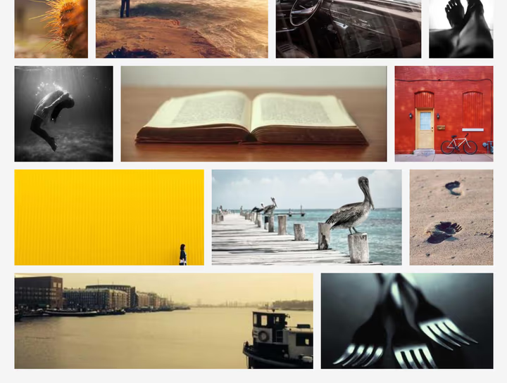
Even with proportional flex-grow, the cropping on an incomplete last row is severe. Unfortunately, you cannot disable cropping only for the last row with pure CSS.
Justified Layout: The JavaScript Solution
What if instead of cropping or distributing extra space, we scale each row independently so all rows fit the container exactly? This is what the justified row layout does: keep images within each row at equal height, then scale that height so the row spans the full container width.
There’s no pure CSS solution for this layout, but JavaScript implementations are effective. The justified-layout library is a solid starting point (interactive demo).
The rhythm is softer than in column layouts because row heights vary with their contents. At narrower viewports, fewer photos fit per row, so row heights vary more and the pattern reads less mechanical. This variation can make the layout feel more organic while still preserving aspect ratios.
In summary: justified rows favor wide formats while preserving compositions. Landscape dominance combined with pronounced horizontal rhythm makes this layout particularly suitable for collections where landscape photos are the focus — the visual hierarchy naturally showcases wide images at their intended scale. The CSS Flexbox approach offers a starting point with trade-offs, while JavaScript provides the precision needed for professional photography galleries.
What if your collection mixes orientations freely and you want to avoid favoring any particular format?
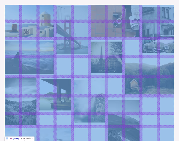
A Different Strategy: Matching Photos to Grid Cells
One of the key goals for navigational galleries is to give all photos — regardless of orientation — equal visual weight, without cropping, and ideally without relying on client-side JavaScript. The cell-span layout is an approach designed to strike that balance.
Conceptually, it’s similar to the contain/fit method: we place the images on the grid without cropping. But instead of forcing every photo into a single target aspect ratio (which inevitably favors some shapes over others), we define multiple targets: landscape, square, and portrait. Each photo is assigned a calculated number of grid cells based on its orientation:
- Landscape: 2 rows × 3 columns (area = 6 cells)
- Square: 2 rows × 2 columns (area = 4 cells)
- Portrait: 3 rows × 2 columns (area = 6 cells)
This approach deliberately gives portrait and landscape photos equal visual area (6 cells each), while squares occupy less space (4 cells). This isn’t an oversight — it reflects the reality that square images are typically obtained by cropping original landscape or portrait photos. Treating them as slightly smaller acknowledges their derived nature. The aspect ratios for portrait and landscape are chosen to match common camera formats (3:2). However, you can adjust these targets based on your collection’s characteristics, or even add more categories, like panorama or very tall portrait, if needed.

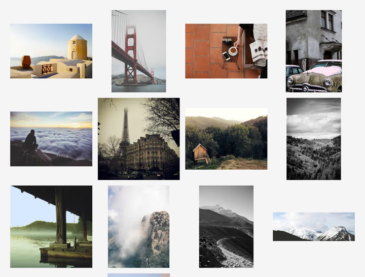
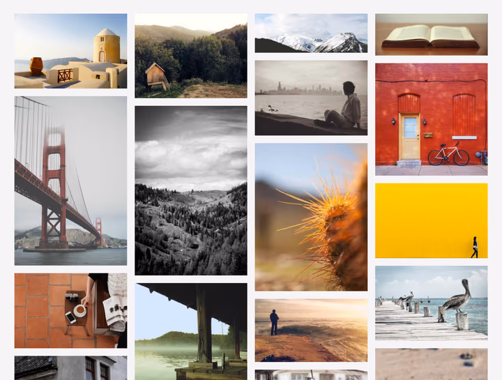
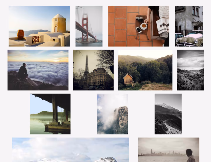
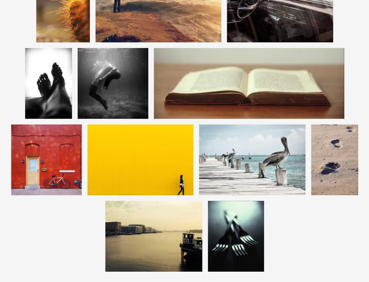
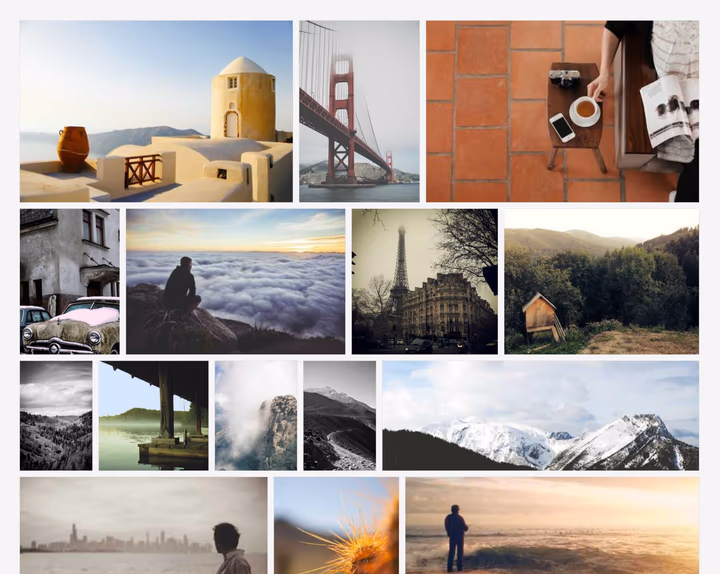
Here’s how this looks in practice — the cell-span grid handles mixed orientations naturally, and portrait shots sit alongside wide landscapes with neither dominating visually (interactive demo):
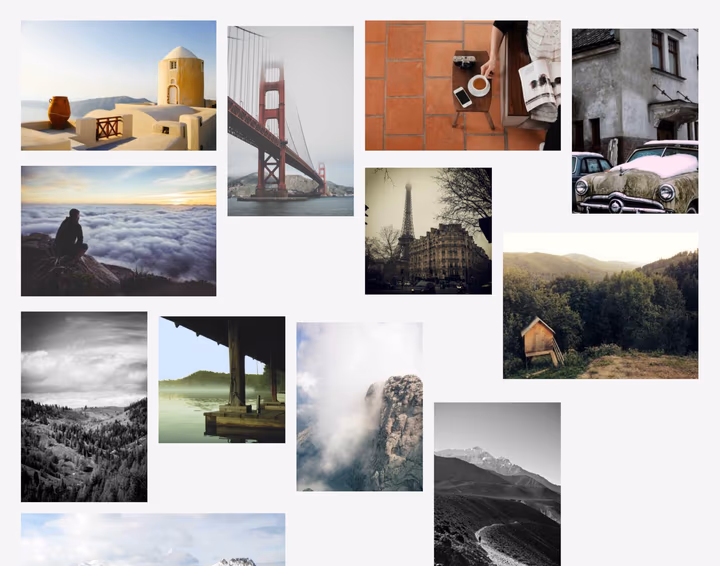
At first glance, the photos seem almost randomly placed — there are no rigid grid lines. The layout feels more like frames pinned to a wall than tiles in a spreadsheet. Yet beneath the surface lies a structured grid, with each photo positioned within cells that match its orientation.
The implementation is straightforward with CSS Grid. The key is using grid-row: span and grid-column: span to make each photo occupy multiple cells:
.gallery {
  display: grid;
  grid-template-columns: repeat(auto-fill, minmax(5rem, 1fr));
  gap: 1rem;
}

.landscape { grid-row: span 2; grid-column: span 3; }
.square    { grid-row: span 2; grid-column: span 2; }
.portrait  { grid-row: span 3; grid-column: span 2; }
Notice the three classes — .landscape, .square, and .portrait. This reveals a practical requirement: you need to know each photo’s orientation in advance to assign the correct CSS class.
The classification logic is straightforward:
// Classify images by aspect ratio
function getPhotoClass(width, height) {
  const aspectRatio = width / height;

  if (aspectRatio > 1.2) return 'landscape';  // wider than tall
  if (aspectRatio < 0.8) return 'portrait';   // taller than wide
  return 'square';                             // roughly square
}
Run this server-side during build or rendering to avoid layout shifts. For static sites, this happens once at build time; for dynamic galleries, cache the results. The thresholds (1.2 and 0.8) can be adjusted based on your collection’s characteristics and chosen span values.
The cell-span grid adapts naturally to narrower viewports. For mobile devices, it’s important to size grid cells and gaps so that at least three columns are visible — otherwise, landscape photos (which span 3 columns) would extend beyond the viewport. In practice, on narrow screens landscape photos typically span the full width while portraits occupy two columns, leaving one empty.
A practical advantage of this CSS Grid approach: content fills naturally in reading order — left-to-right, then top-to-bottom. Unlike the CSS columns layout (which fills top-to-bottom first), the cell-span grid presents photos in their source order, making chronological browsing intuitive without requiring JavaScript. This natural flow also means that keyboard navigation and screen readers traverse photos in the same sequence as visual browsing.
What about visual rhythm? Unlike strict cell-based grids, the cell-span layout doesn’t produce strong, continuous leading lines — gaps don’t always align. However, the underlying grid still imparts a subtle bidirectional rhythm, inherited from the grid structure, but because photos span multiple cells and gaps don’t consistently line up, the result feels less mechanical and more organic.
The Cost: Empty Cells by Design
This organic feel comes at a cost. The approach sacrifices space efficiency for equal presentation — and that trade-off explains why this layout is rarely seen in practice.
The inefficiency manifests in two ways. First, because photos span multiple cells, some cells can get trapped between spans, creating unusable pockets of space. These cells sit surrounded by photo spans and cannot accommodate new images.
Second, when the viewport width doesn’t evenly accommodate photo spans, entire columns could remain unused. Consider these scenarios:
- 5 columns: Portrait (2) + Landscape (3) = perfect. But Portrait + Portrait = 4, leaving 1 empty column.
- 4 columns: Portrait (2) + Square (2) = perfect. But Landscape (3) leaves 1 unused column.
- 3 columns: Landscape (3) fits perfectly, but portrait (2) leaves 1 empty column.
The inefficiency is inherent to the approach. Even with zero gap size, the trapped cells and unused columns persist — a direct consequence of giving equal visual weight to different orientations. You cannot tune the aspect ratios or adjust spacing to eliminate this waste, unlike previous layouts where gap adjustments could improve space utilization. This fundamental trade-off is likely the main reason why the cell-span approach is rarely seen in practice.
Yet despite this cost, the wasted space feels less jarring than in the contain/fit layout. Because there are no strong leading lines, the empty cells don’t disrupt the overall flow but read as natural breathing room. When the number of wasted cells is not excessive, cell-span layout can actually be more space-efficient than the contain/fit approach, since a larger proportion of photos matches the target aspect ratios more closely. For a navigational gallery where the goal is equal browsing weight rather than maximum density, this trade-off makes sense.
Beyond space efficiency, there’s another practical consideration: performance. The computational cost for classifying your images depends on your data architecture. If you already know image dimensions or aspect ratios (stored in a database, image manifest, or metadata file), determining orientation is trivial — a few comparisons per image. If you need to read dimensions from image files, performance depends on I/O speed. In the worst case, you might need to fetch each image to read its headers. For static sites, this happens only once at build time; for dynamic galleries, caching dimension data is advisable.
When Equal Presentation Matters More Than Efficiency
Every gallery layout encodes a philosophy about how photographs should be presented. Square grids declare that consistency matters more than composition. Masonry columns prioritize space efficiency and accept that portraits will dominate. Justified rows favor landscapes. Each choice reflects different values.
The cell-span layout documented here prioritizes something different: equal visual weight across orientations without cropping. Landscape and portrait photos occupy comparable screen area. Squares appear slightly smaller, acknowledging their cropped nature. The price is space efficiency — some grid cells remain unused — but the benefit is a gallery that treats every photograph fairly, regardless of how it was framed.
This approach makes most sense for navigational galleries: collections where the viewer browses freely and no image should be privileged by the layout itself. If you’re building an editorial gallery — one where hierarchy and sequence tell a story — you probably want deliberate visual weight differences and tighter control over adjacency. But if you’re presenting a collection for discovery, and you want portraits and landscapes to have equal presence, a cell-based grid with calibrated spans offers a straightforward path.
The implementation is client-side JavaScript-free when using server-side rendering or static site generation — orientation detection happens once during build, then CSS handles everything. For dynamic scenarios, orientation calculation is simpler than justified layout algorithms.
You can see this approach in action at kadykov.com/photos, and explore the source code for implementation details.
The choice you make about gallery layout isn’t just technical — it’s philosophical. Every time you choose a layout, you’re declaring what matters: space efficiency, visual consistency, or equal presentation. Most galleries optimize for the first two because they’re easier to measure and justify.
But if you believe that a landscape and a portrait should have equal presence on the page — that neither orientation should be privileged by default — then the cell-span approach offers a clear path forward. The implementation is straightforward, the trade-offs are transparent, and the result returns to first principles: showing photographs as they were composed, in full, without cropping.
That fundamental respect for the photograph’s original frame is what separates navigational galleries from editorial ones, and what makes this approach worth considering despite the space it leaves unused.